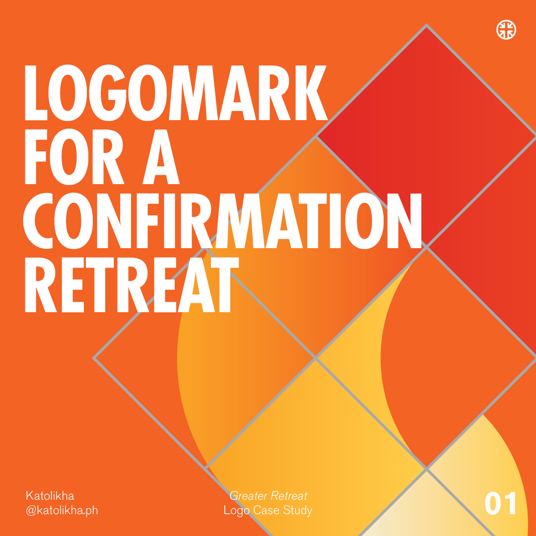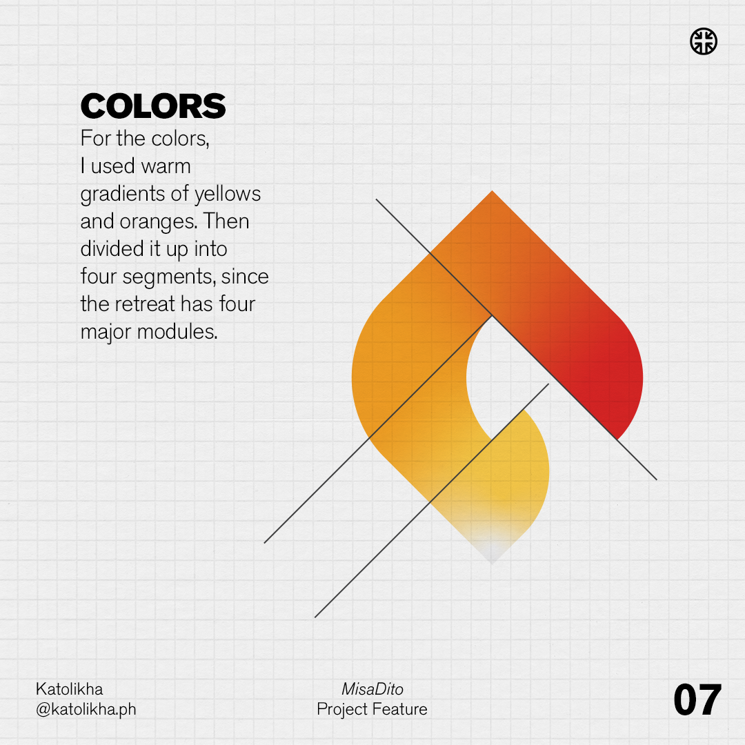
BRANDING
Spirit and Fire
Spirit and Fire
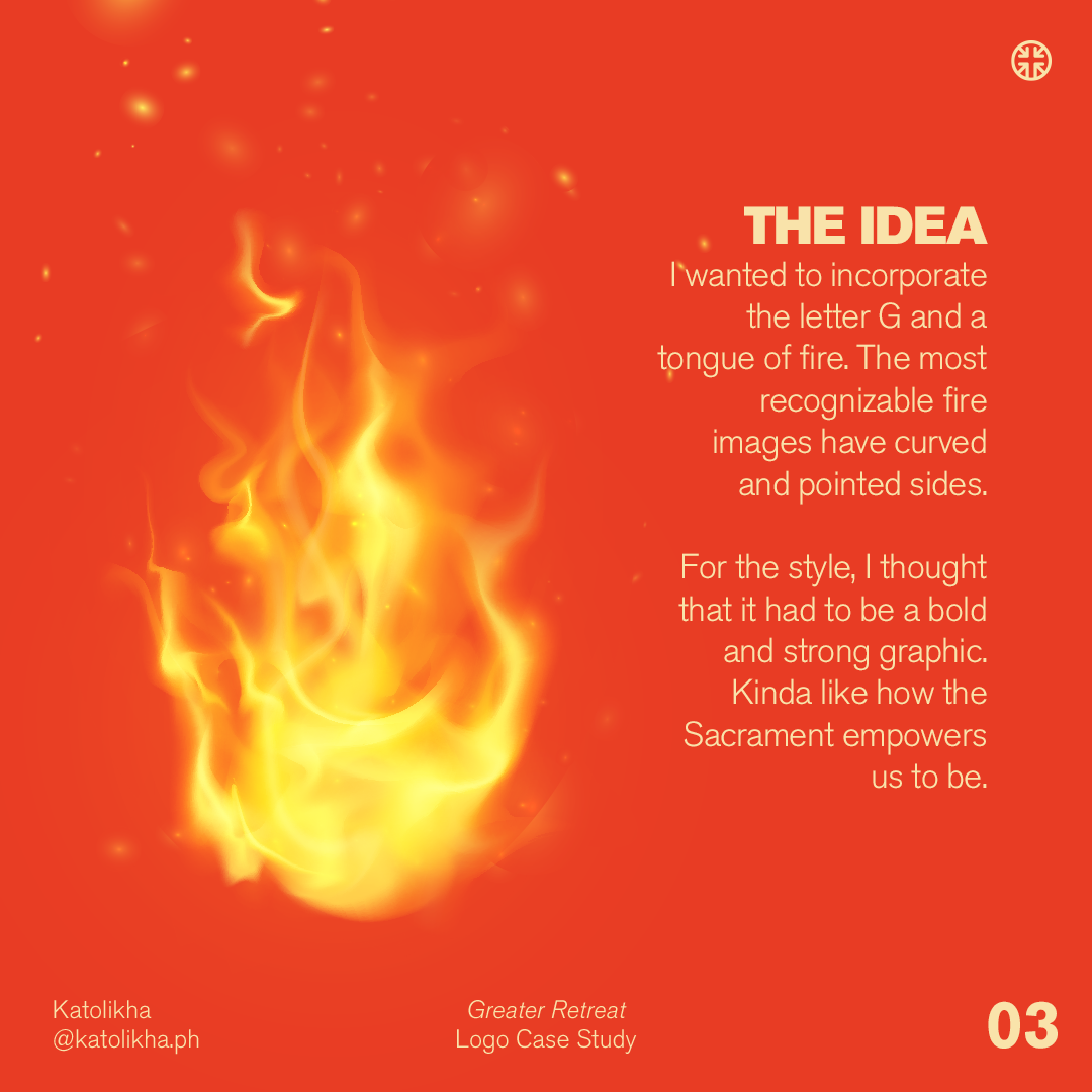
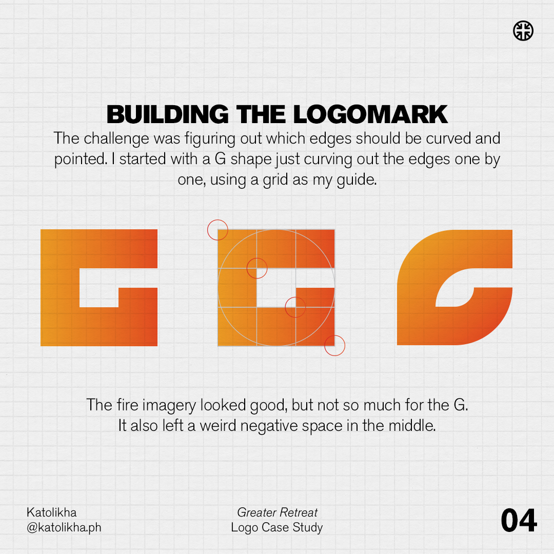
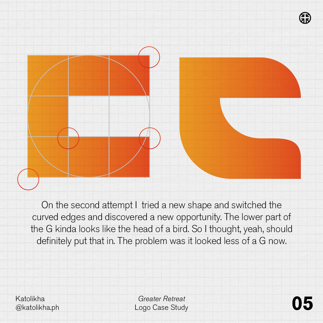
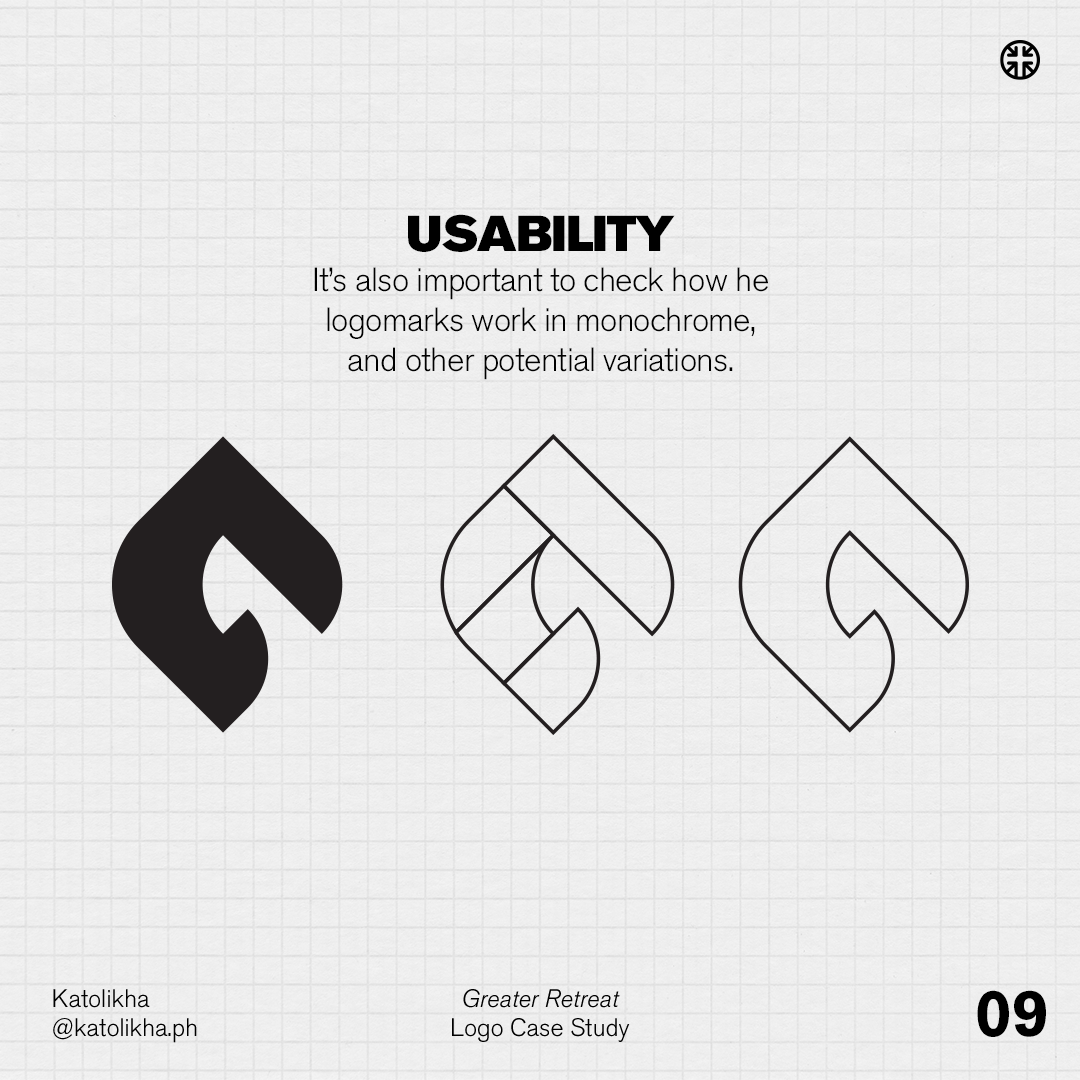
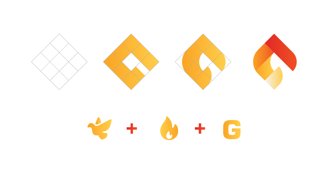
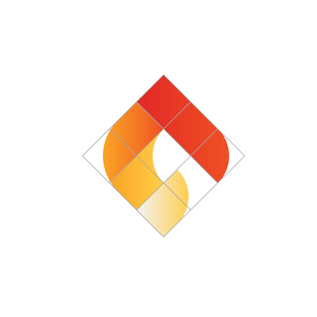
I had the idea of making a logomark incorporating the Holy Spirit, Fire, and the letter G, for Greater. I found that a geometric system would work for the G, but I'd have to tweak it a bit to put in the fire and Spirit elements. Curving some of the edges made it work.
The mark is also segmented into 4, to highlight the 4 different sessions in the program.
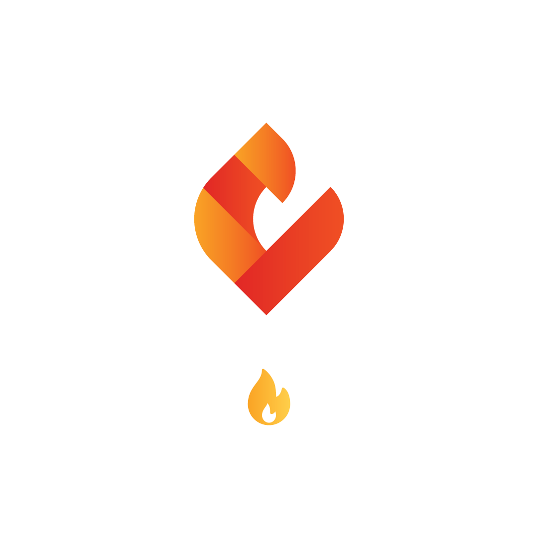

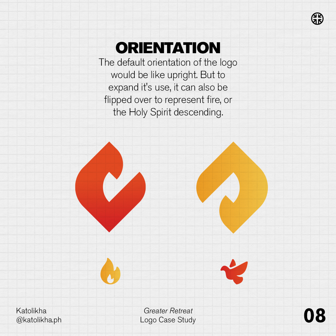
Another thing was that if you rotate the logo, it can be used as either as fire, or as the Spirit, depending on the context it is being used.