I was graciously approached by the people behind HOME Foundation for their branding and launch in 2025. The task was to improve upon and build a robust system for their visual identity.
This color palette features a harmonious blend of hues that beautifully draw inspiration from the natural world while embodying both nurturing qualities and strength.
Together, these colors illustrate how nature can inspire feelings of connection and purpose. The femininity of this palette is evident in its soft and welcoming tones—particularly the pinks—conveying warmth, care, and nurturing. At the same time, the solid and grounding presence of green and taupe provides a strong foundation, ensuring this palette exudes both stability and resilience.
It strikes a balance that feels rooted in values of growth, care, and strength—making it perfect for a foundation aiming to empower and support those who cultivate a harmonious and flourishing environment.


"Where your ordinary work is done, there is your opportunity for holiness." Saint Josemaría Escrivá
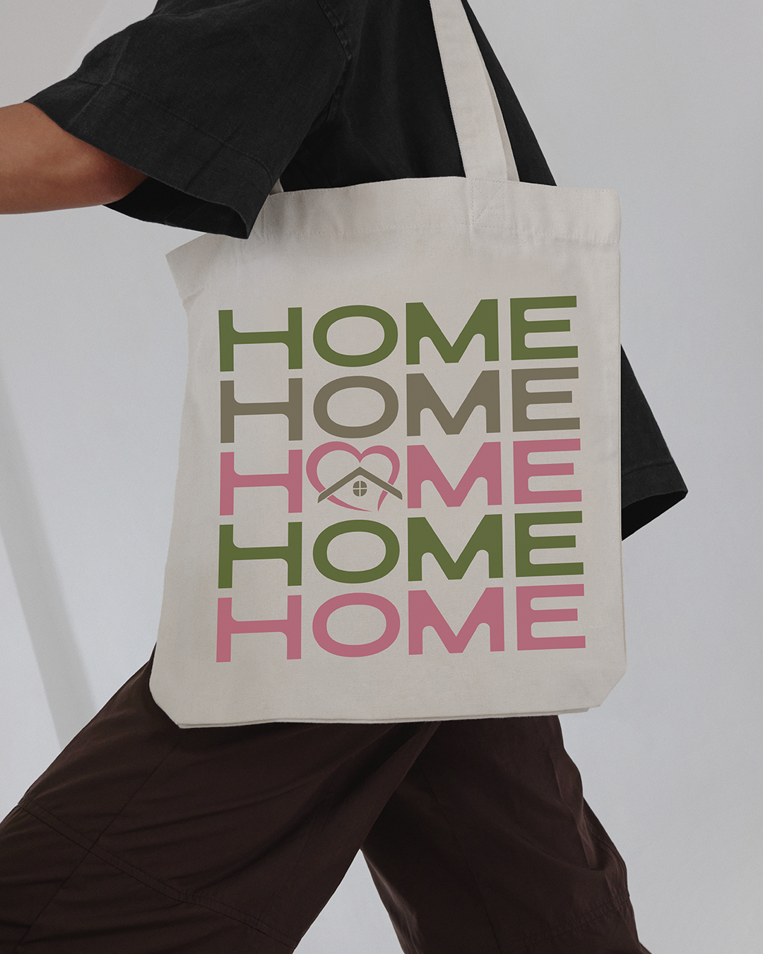
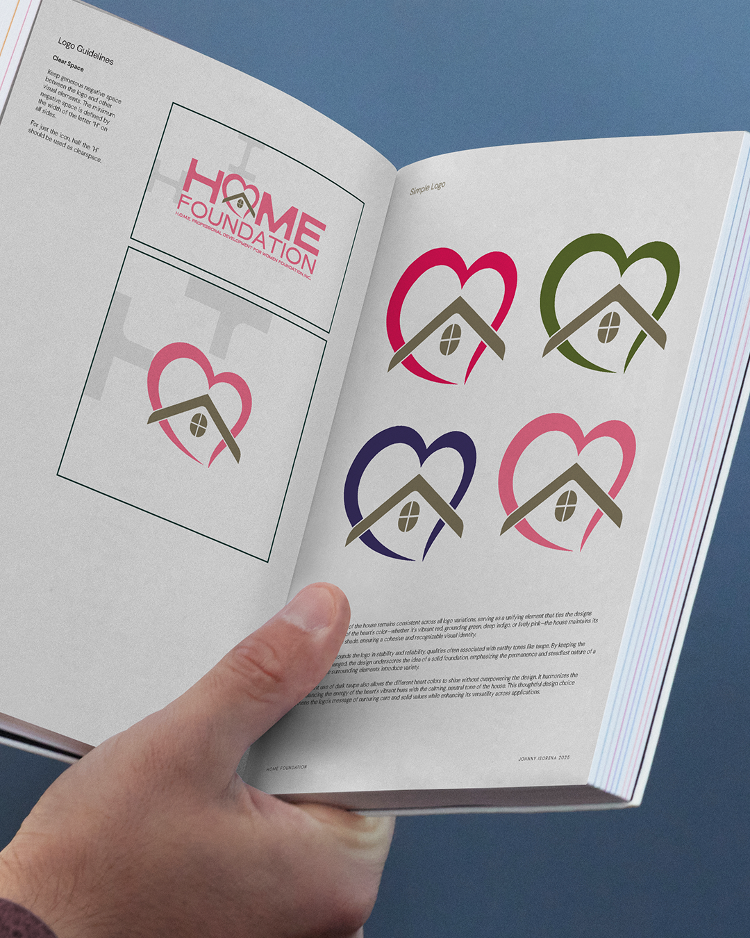
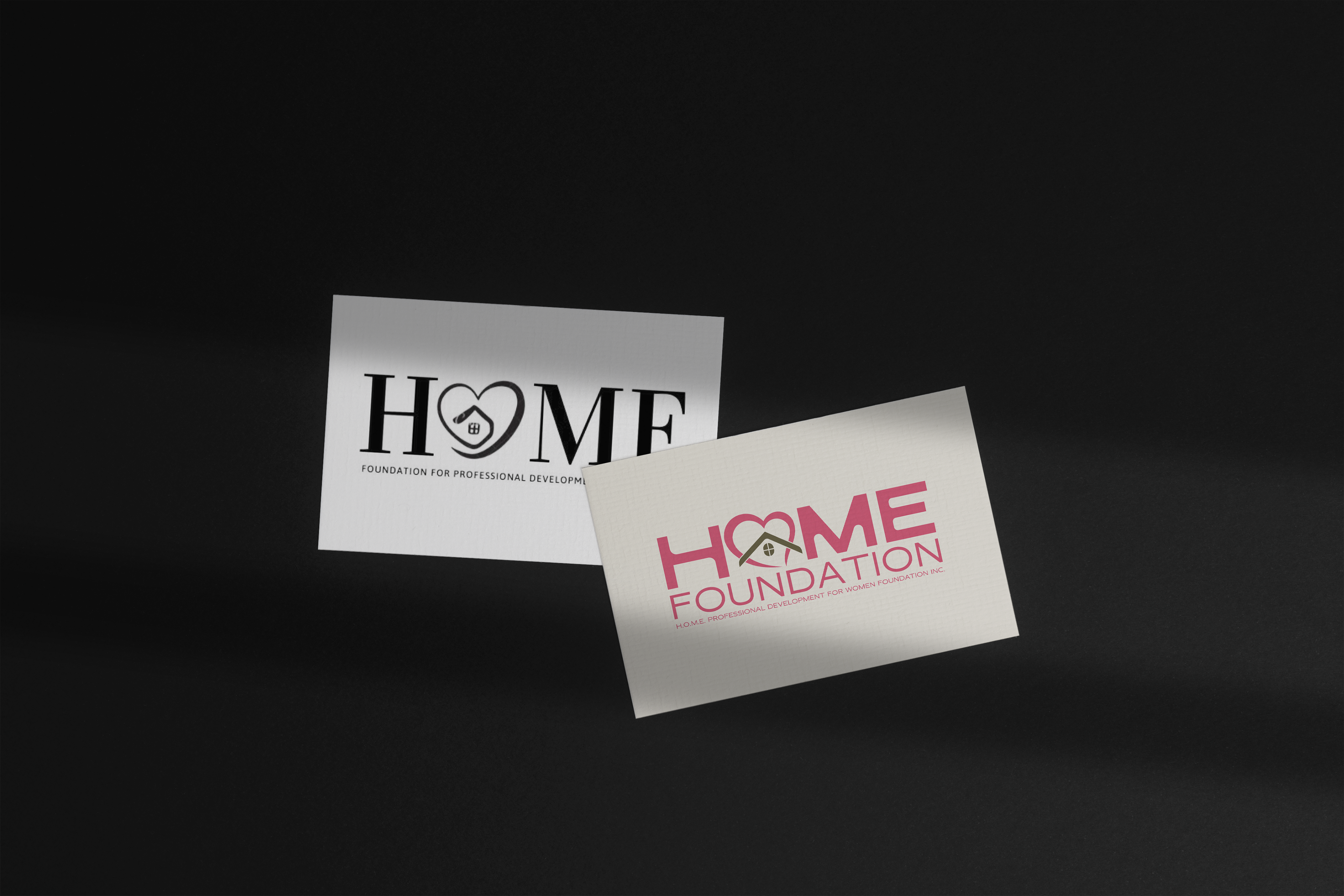
The logo encapsulates a sense of warmth and local charm through its central element: a slender, gracefully curved heart. This heart exudes a feminine touch, symbolizing the love, care, and compassion required to nurture a home. Its elegant curves make it inviting and emotionally resonant, capturing the essence of tenderness and connection.
Seamlessly integrated into the heart's design is a house, with its roof blending naturally into the curves of the heart. A circular window with a cross pattern adds a quaint and charming detail, symbolizing balance and the merging of emotional nurturing with the creation of a safe and flourishing space. This fusion highlights the unity of love and a solid home foundation.

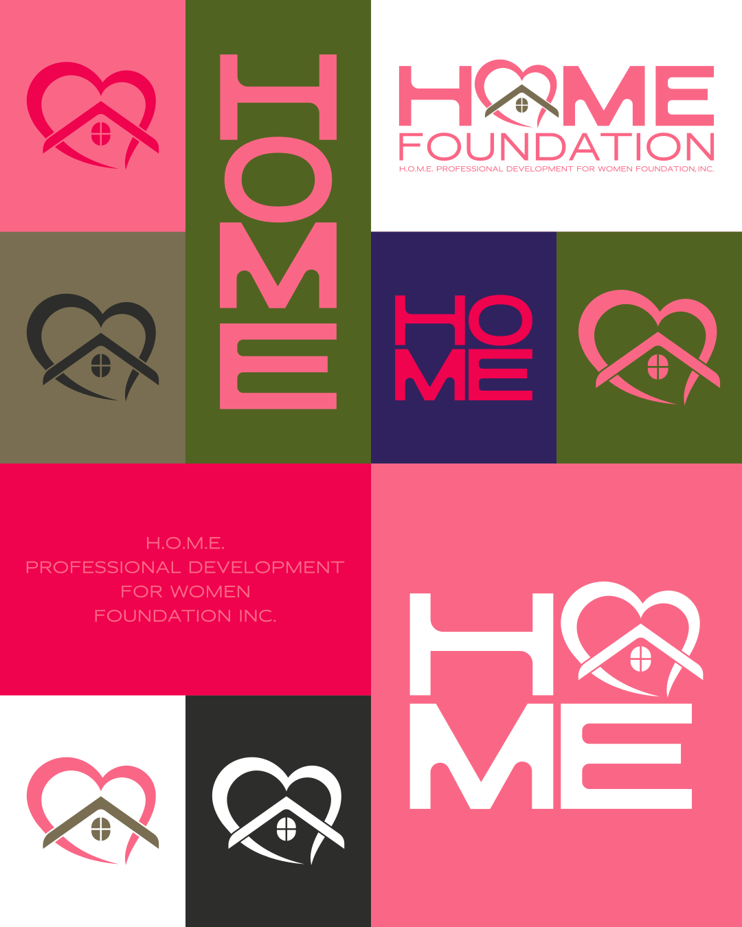
The logo type is crafted using a modified version of Malm, a font designed by Filipino type designer Albert Zedrick. This font modification reflects a harmonious interplay of hard and soft edges, creating a dynamic and meaningful design.
The hard edges, particularly visible in the verticals and angular segments of the font, evoke a sense of skill, strength, and foundation. They suggest stability and reliability—qualities that form the riverbed of a strong organization.
The soft, rounded edges balance this by introducing a sense of nurturing, love, and capability, adding warmth and approachability to the logo type. These elements invite trust and emphasize the human and caring aspect the design represents.
This thoughtful contrast mirrors the duality of strength and compassion, making it both modern and deeply symbolic. It perfectly aligns with the overarching theme of the logo, embodying Catholic values of enduring faith and love while grounding them in strength and capability. The use of a Filipino-designed font also adds a layer of cultural authenticity, celebrating local craftsmanship and creativity.