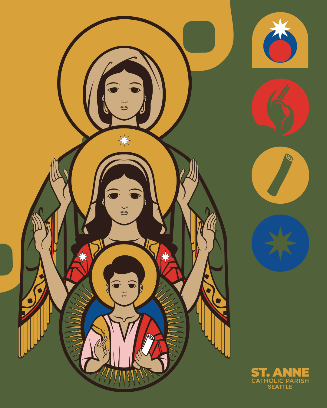
I got to work with sacred art illustrator @gelo.rome for The St. Anne Catholic Parish rebrand back in 2021.
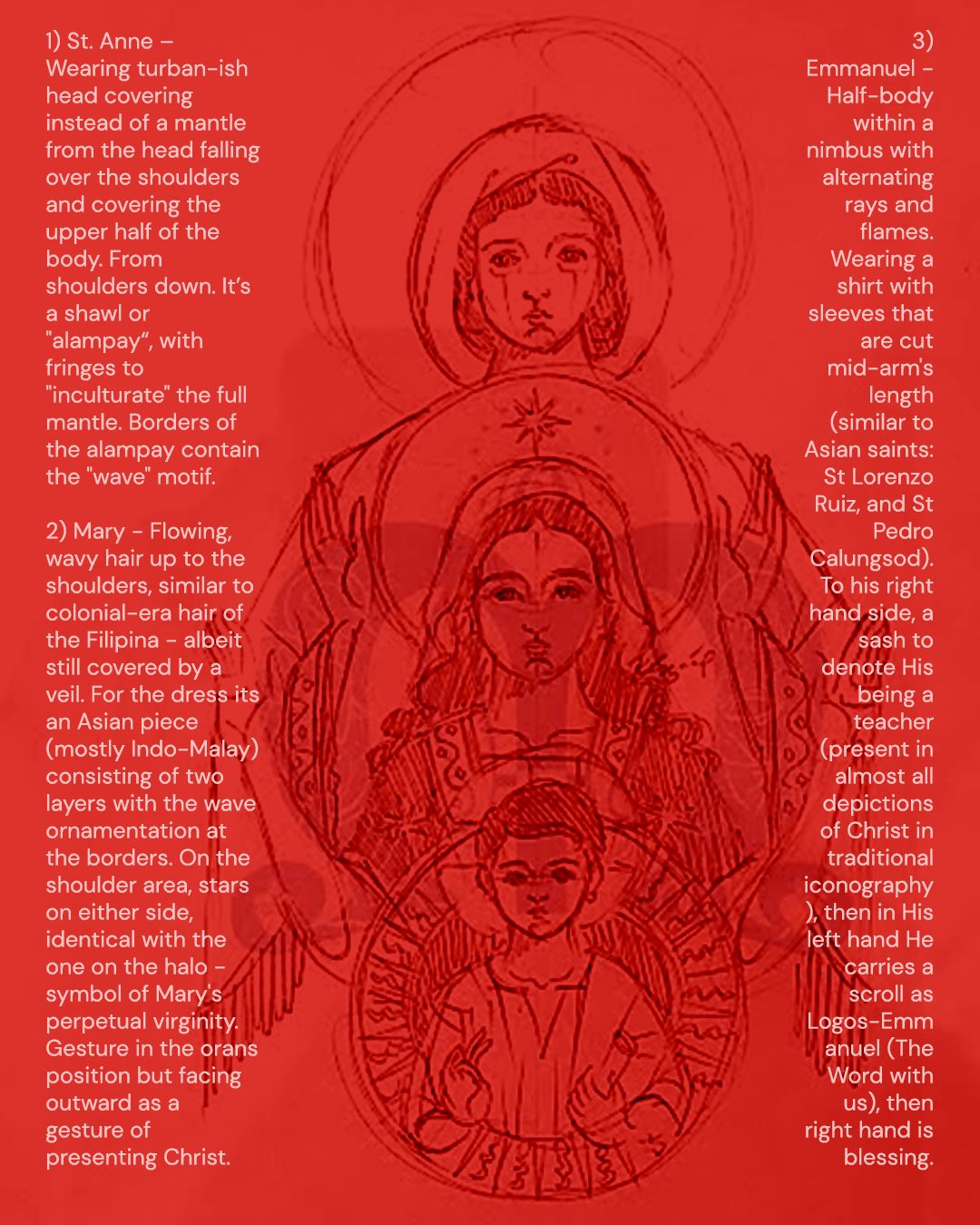
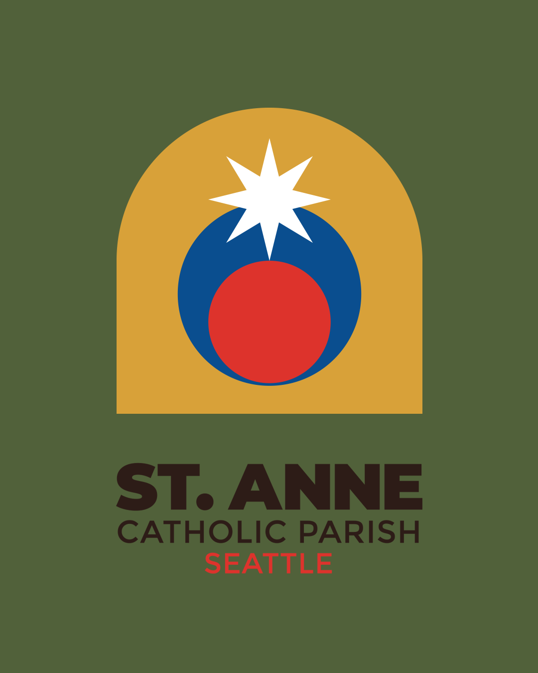
The logo was redesigned as a modular system to address the parish’s shifting demographic and communication needs. It features an elegant depiction of St. Anne and Mary with Asian appearances, embracing inclusivity, alongside geometric elements and a wave motif symbolizing continuity and faith. Guided by formal design principles, the modular approach allows parts of the logo to be repurposed across various events and materials, ensuring versatility while maintaining a cohesive and culturally relevant brand identity.
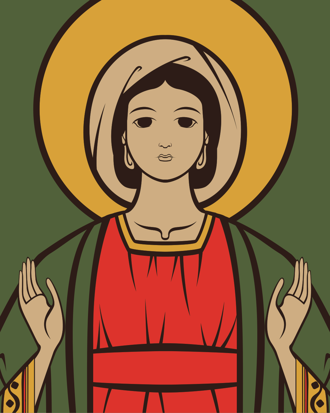
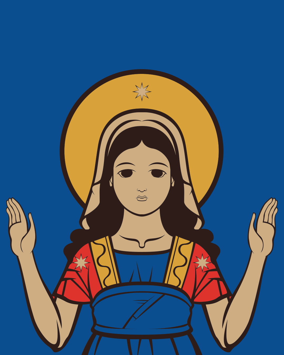
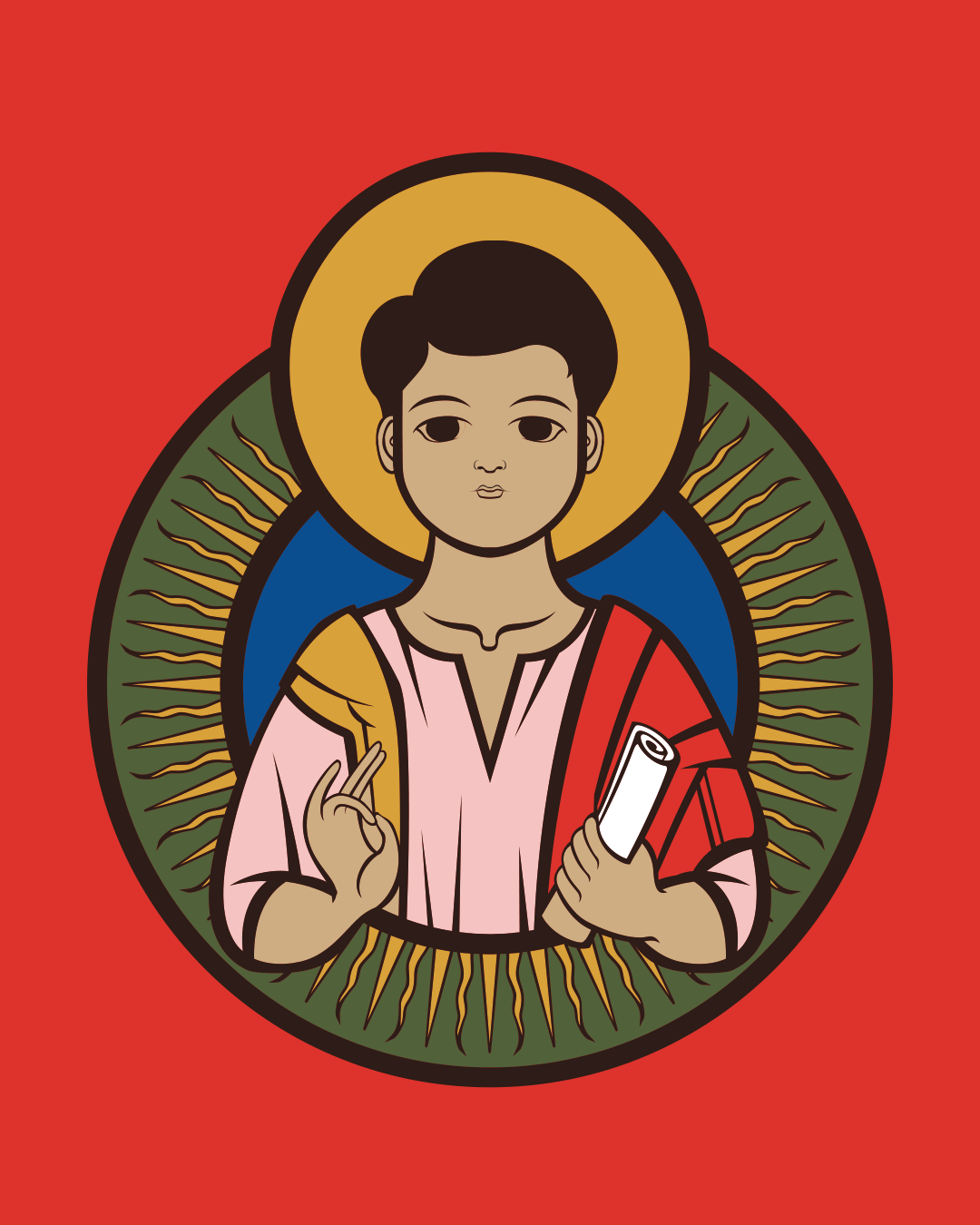
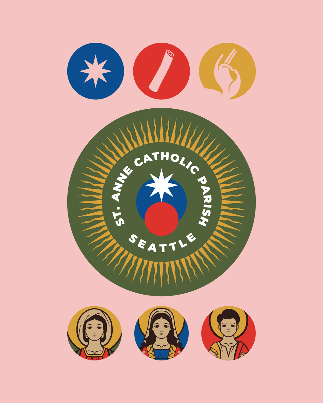
While these colors were not the ones we ended up using for the main logo, we think this alternative palette also embraces the message of the rebrand.