Harvest Gold represents divine grace, hope, and human dignity, illuminating the brand’s vision to empower long-term success while keeping people at the heart of its mission.
Pickled Bluewood symbolizes wisdom, calmness, and trust, embodying the brand’s steady and insightful guidance as it journeys alongside businesses towards clarity and growth.
Jasper conveys the brand’s passion and dedication to untangling financial struggles, reflecting humility and authenticity in its purpose to serve and uplift businesses.
Together, these colors harmoniously blend to create an ambiance rooted in the strength and permanence of the natural world. The overall selection of these hues and their values conveys strength and depth, reflecting the painting's profound themes and emotional resonance.
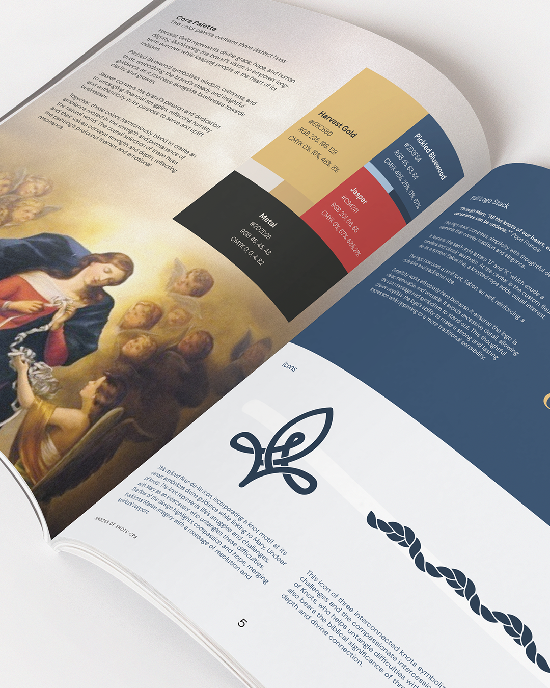
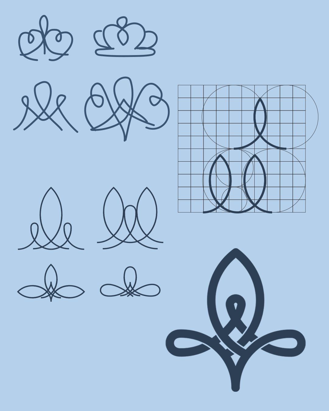
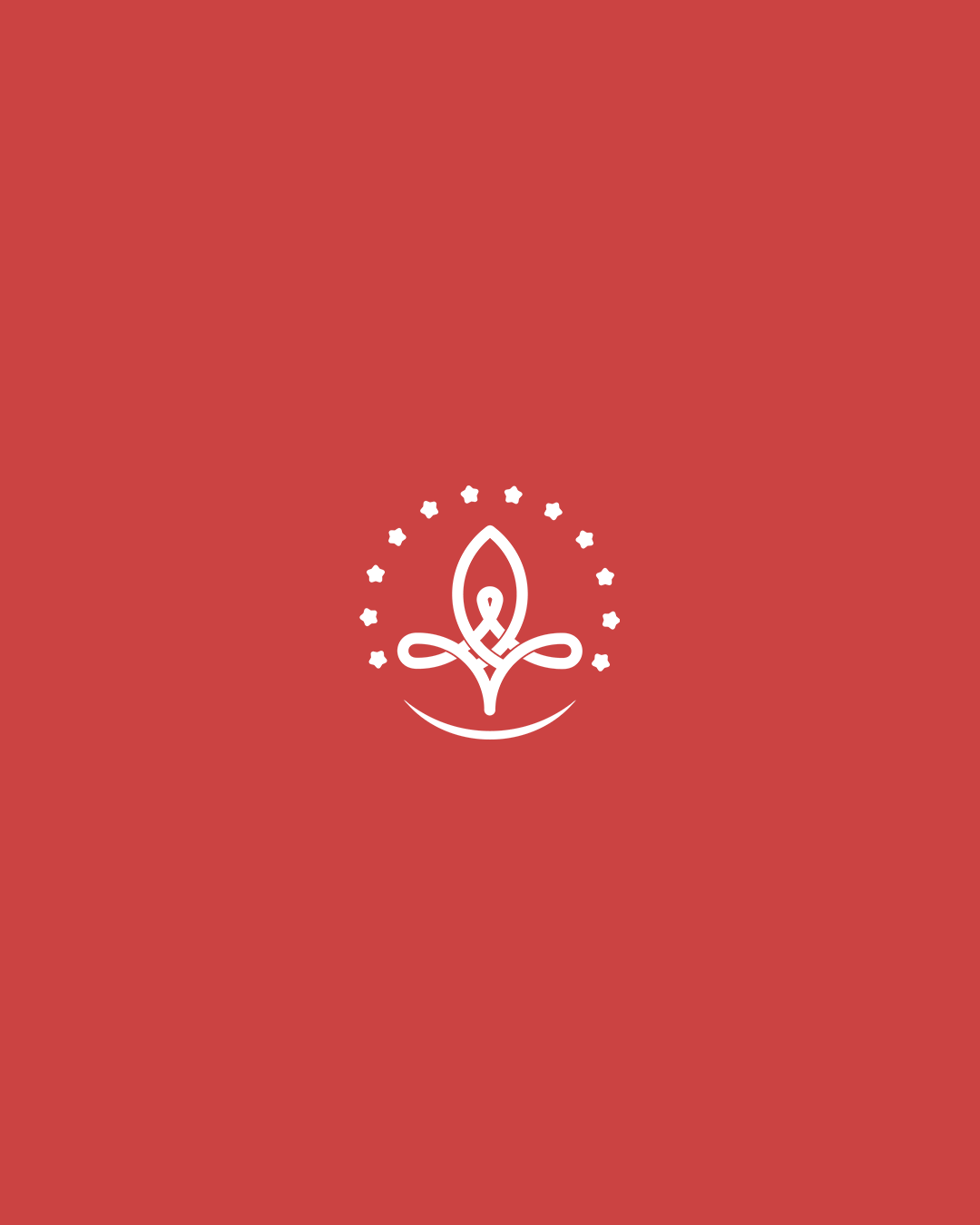
This stylized fleur-de-lis icon, incorporating a knot motif at its center, symbolizes divine guidance while linking to Mary, Undoer of Knots. The knot represents life's struggles and challenges, with Mary as an intercessor who untangles these difficulties. The flow of the design highlights compassion and hope, merging traditional Marian imagery with a message of resolution and spiritual support.
"Through Mary, “All the knots of our heart, every knot of our conscience can be undone.”" Pope Francis
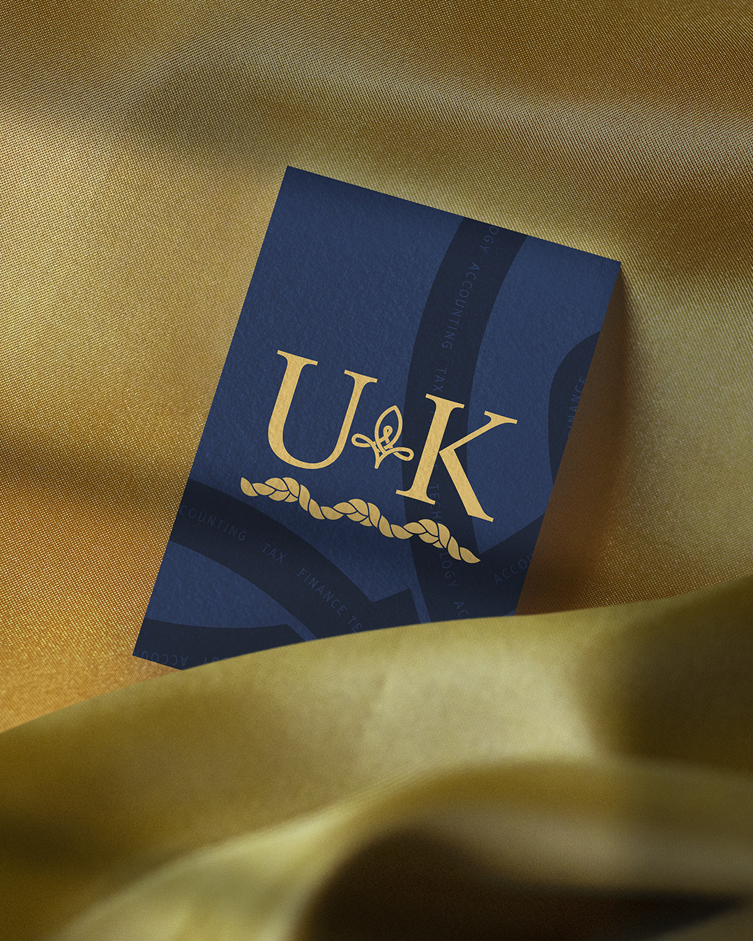
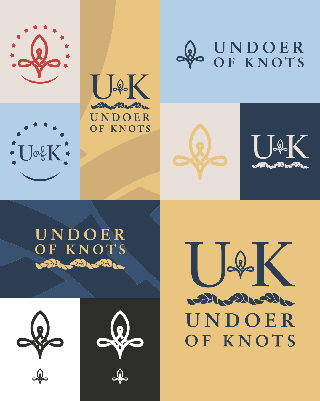
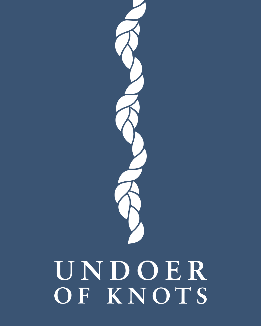
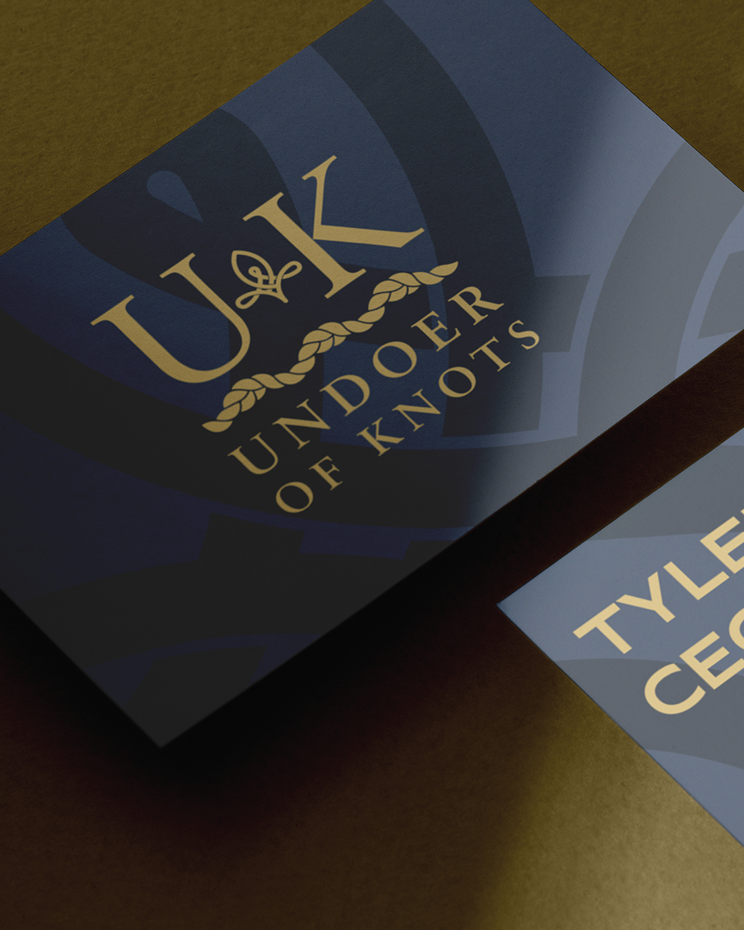
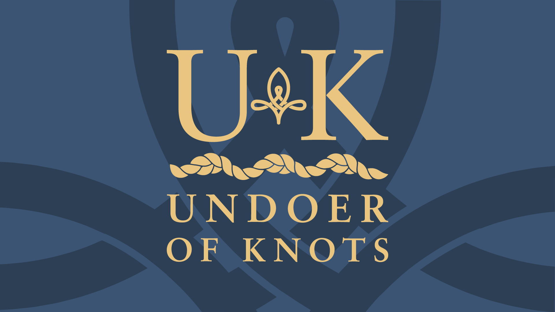
The logo stack combines simplicity with thoughtful design elements that convey tradition and elegance.
It features the serif-style letters "U" and "K," which exude a timeless and classic aesthetic. At the center is the custom fleur-de-lis, a symbol. Below this, a knotted rope adds visual interest.
The logo now uses a serif font, Sabon, as well, reinforcing a cohesive and traditional vibe.
Simplicity works effectively here because it ensures the logo is clear, memorable, and versatile. It avoids excessive detail, allowing the core message and symbolism to stand out. This thoughtful choice amplifies the logo's ability to make a strong and lasting impression while appealing to a more traditional sensibility.